Custom classes
Video Components
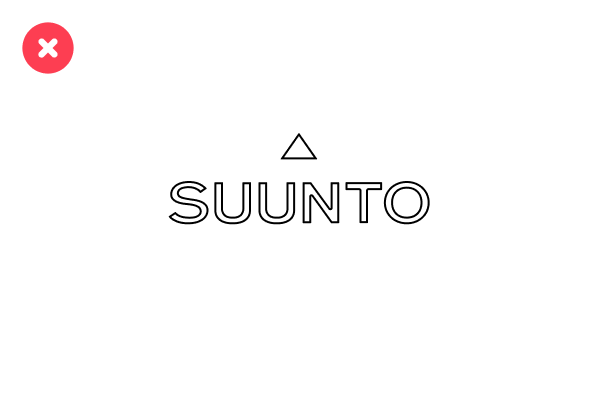
Color Components
.svg)

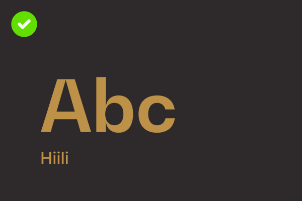
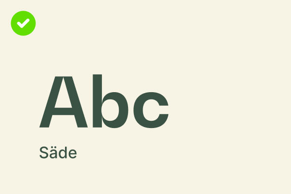
CMYK 0 90 75 0
RGB 140 50 65
HEX #EF3340
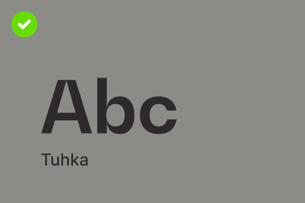
CMYK 0 0 0 100
RGB 0 0 0
HEX #000000
RGB 255 255 255
HEX #ffffff
RGB 244 244 244
HEX #F4F4F4
RGB
PANTONE
CMYK
RGB
PANTONE
CMYK
RGB
PANTONE
CMYK
RGB
PANTONE
CMYK
RGB
PANTONE
CMYK
RGB
PANTONE
CMYK
RGB
PANTONE
CMYK
CMYK 0 90 75 0
RGB 140 50 65
HEX #EF3340
CMYK 0 0 0 100
RGB 0 0 0
HEX #000000
RGB 255 255 255
HEX #ffffff
RGB
PANTONE
CMYK
RGB
PANTONE
CMYK
RGB
PANTONE
CMYK
RGB
PANTONE
CMYK
RGB
PANTONE
CMYK
RGB
PANTONE
CMYK
Image Components


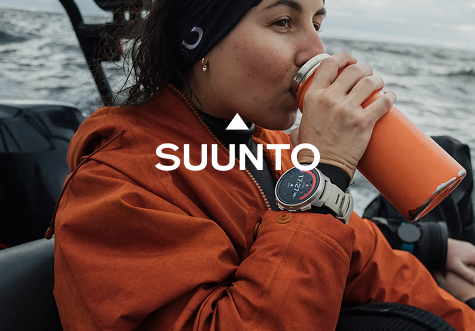
Do's
Start with a strong hook that grabs attention and sparks curiosity.
Example: What's waiting beyond the next peak?
Highlight a clear benefit or emotional payoff.
Example: Navigate every trail with confidence, no matter the challenge.
Use action-oriented language that encourages engagement.
Example: Discover the watch that keeps up with your wildest adventures.
Match the tone to the audience. Be relatable, inspiring, and authentic. Example: Built for explorers, trusted by adventurers.
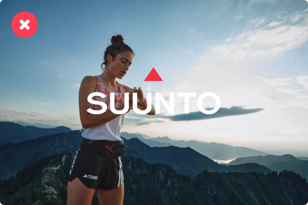
Dont's
Be vague or uninspiring.
Example: Our waches are really good for outdoor adventures.
Overload with technical details.
Example: Packed with XYZ feature, ABC sensor, and 3D mapping...
Use clichés or overused phrases.
Example: Take it to the next level!
Forget a call to action.
Example: Learn more. (What should they feel or imagine after seeing this?)
Do's
Write like you’re talking to a friend.
Example: That first sip of coffee before a sunrise hike — what’s your favorite trail tradition?
Share stories or moments your audience can connect with.
Example: After 4 days on the trail, and one big storm, we finally reached the summit. Worth every step. #TrailLife
Use emojis to add personality, but keep them relevant.
Example: New gear, same mission: explore more. 🧭
Keep newsletters focused and value-driven.
Example: Top trails for winter adventures + how your Suunto watch can guide you there. Read more.
Dont's
Be overly promotional or pushy.
Example: Buy now! This is your last chance to get the best watch on the market!
Use too much jargon or technical terms.
Example: Our watches feature multi-GNSS, barometric FusedTrack™, and 100-hour battery life...
Overload posts with emojis or too many hashtags.
Example: Adventure awaits!!! #Adventure #Explore #TrailRunning #Hiking #OutdoorsLife
Forget to encourage engagement.
Example: Posting without a question or call to action, such as: Our new collection is live.
Do's
Use clear, actionable language that focuses on the user’s needs.
Example: To start tracking your run, press the top button, and select 'Running' from the activity menu.
Break down complex tasks into easy-to-follow steps.
Example:
How to pair your Suunto watch with the app
– Turn on Bluetooth on your smartphone
– Open the Suunto app and select ‘Pair new device’
– Follow the on-screen instructions
Include helpful context or troubleshooting tips.
Example: If your watch doesn’t connect, ensure it’s in pairing mode and restart Bluetooth on your phone.
Use calm, supportive phrases to reassure users.
Example: You’re just a few steps away from getting started.
Dont's
Overload the page with too much text or technical jargon.
Example: Using a dual-frequency GNSS chipset ensures precise coordinates in multi-path environments.
Use vague or unhelpful instructions.
Example: Sync your watch to the app following the usual steps.
Rush through the information without enough detail.
Example: Just press the button to track your activity.
Use an overly casual or chatty tone.
Example: No worries—just hit the button, and you’re good to go!
Heading possible, but won't show up in the side navigation
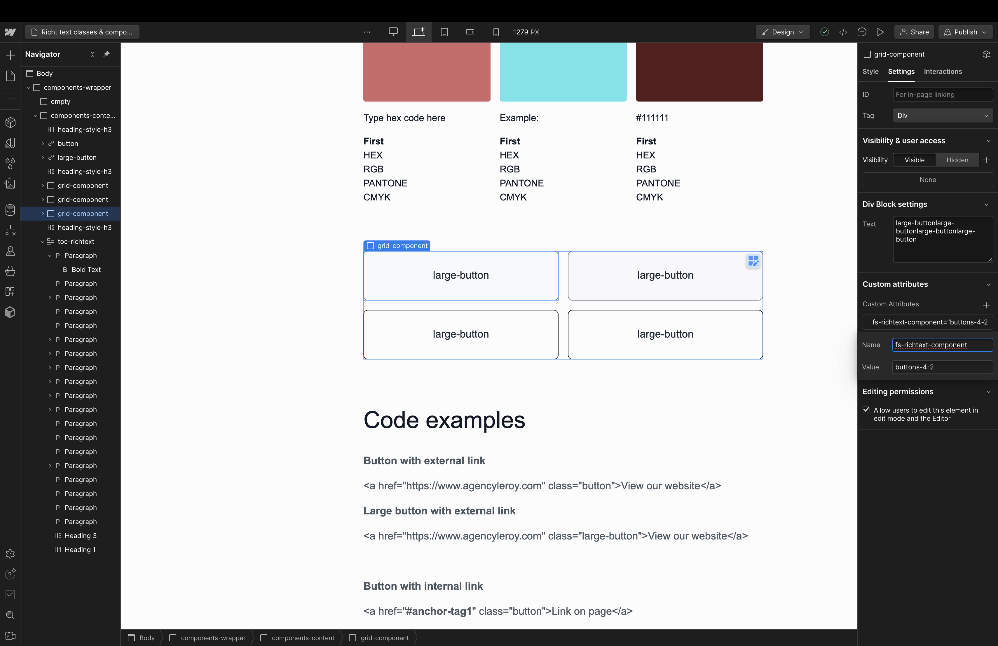
This has a smaller text size than the other option. Select the .grid-component wrapper of these double columns and make sure they have a unique [fs-richtext-component] attribute name.
- Testing bulletpoints here.
- Works too!
Or make a paragraph bold and hit enter
This one uses: double-column-text-2 and can be used on a page when placing the following in between the text on the homepage: {{double-column-text-2="/rtc"}}
Code examples - copy these
Button with external link
<a href="https://www.agencyleroy.com" class="bb-button">View our website</a>
Large button with external link
<a href="https://www.agencyleroy.com" class="large-bb-button">View our website</a>
Button with internal link
<a href="#anchor-tag1" class="bb-button">Link on page</a>
Required tag to link to: <div id="anchor-tag1"> </div>
Large button with internal link
<a href="#anchor-tag-h3" class="large-bb-button">Link on page</a>
Required tag to link to: <div id="anchor-tag-h3"> </div>
Video
Above on the page there is one example of a video component. This video can be replaced and the same code can be used.
Video: {{background-video1="/rtc"}}


Multiple videos
Multiple videos are also possible. This requires duplicating the video on this page, uploading videos for each and then renaming the attribute to {{background-video2}}, {{...3}}, {{...4}} etc. for each video.


Components
Now on this page there are three components:
Colors component of 3 columns: {{brand-colors-3-1="/rtc"}}
Second colors component of 3 columns: {{brand-colors-3-1="/rtc"}}
Colors component of 4 columns: {{brand-colors-4-1="/rtc"}}
Links component of 2 columns with 4 links: {{buttons-2-1="/rtc"}}
Links component of 3 columns with 3 links: {{buttons-3-1="/rtc"}}
Images component of 3 columns {{images-3-1="/rtc"}}
First images component of 2 columns {{images-2-1="/rtc"}}
These can be added by typing the code highlighted in bold above inside of the rich text field on the homepage. The bolding of this code and text is not required.
These components can be edited with the correct colors of the project as well as new text and new links. New components can be created by duplicating the ones found here. Or new ones can be created (by me). For each component a unique name needs to be set. Follow the screenshots to find out how to do that.
